Project Description
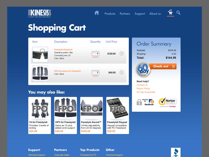
We created an eCommerce site built entirely on a Wordpress platform for the innovative computer ergonomics company, Kinesis Corporation.
This was a huge undertaking with functionality and store/shipping integration that was actually probably more than WordPress could handle. I partnered with some great development talent get it built, integrated, tested and rolled out, with one very happy client.
Project Details
Client Kinesis Corporation
Dates November 2012 – July 2013
Skills User experience, User interface design, Sales, Marketing, Branding, Vendor Management
Begin: Meet with client and brainstorm.
I met with the client to discuss their expectations, minimum requirements, etc., to make sure we had alignment on scope, timeline, and estimated costs.
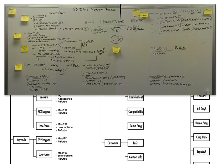
We talked about the user base, and how they tended to use the current site. What did the business want the site to do for them, and any needs with the new web site. The team decided we wanted a flexible system that the business could update, rather than having to maintain development staff. We then created a site map to make sure we were aware of all the pages that were in the Kinesis site.

Set up simple structures and wireframes.
We agreed that if you’re selling ergonomic equipment, you want your eCommerce site to be easy to use. A majority of the customers were ergonomists or corporate buyers who were in the know. They needed to be able to continue looking things up in a way that made sense to them. And the business wanted to make the site more customer friendly for people looking for an ergonomic fix to their workspace problems.
We set up simple wireframes and then a general site structure. Once we were in agreement on details of the interactions, our development team went to work starting to build the backend.
Visual concept design and iterations.
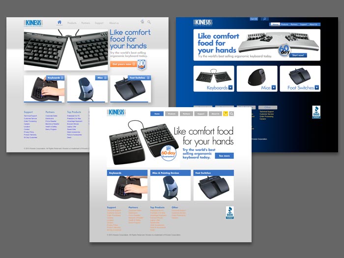
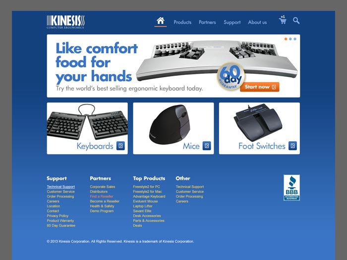
In developing visual concepts for the site, I had to also define how the corporate brand could be articulated from this point forward. Trade show fliers and promotional materials acted as our starting point. I was even able to also provide a POV on voice for Kinesis marketing.
Design is done, but never final.
We made other enhancements to the Kinesis Website since it was launched, including more photography on the home page, and some styled illustrations for some of the informational page. Overall, the site has performed far better than their original site, and they have gotten many great comments on the facelift.


