Project Details
Client Alaska Airlines
Date March 2014
Skills Mobile design, branding, user experience, user interface design
Project Description
The Alaska Airlines mobile team was struggling to find inspiration for their third major redesign of the iPhone app. Work had commenced, but three months into the project and they had one user task flow and a couple of untested wireframes. The Director Mobile Products was struggling to find a way to motivate and inspire his team to make some strategically significant changes to the app. How do you motivate designers? How do you hire the right designers? How do you get them to think bigger than what’s there in front of them?
He asked me to join his team, and accomplish just two things:
- re-energize and direct the design and experience of the iOS app
- begin the process of building an excellent design team
The mobile team had laid some basic ground rules:
- Customer first, always
- Keep things super simple
- Look for ways to delight and inspire
The team was small, consisting of two product managers, one designer, and QA and dev resources. And we were given three months to get this redesign shipped.
And we believed that no traveller should ever be stranded with an app that sucks.

We asked some simple questions.
- What’s the problem?
- For whom are we solving for?
- Where do we start?
- How big is the scope?
- What’s the data say?
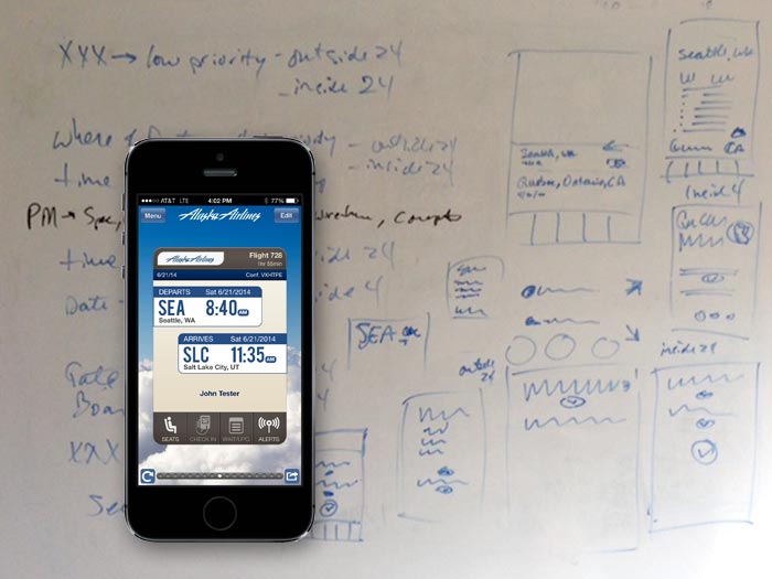
And then we did the normal whiteboard squiggly stuff that you see here. We did it a lot. We also employed card sorting, affinity mapping, and other methods to get down to what the business required, and what the customer really wanted.
Use some design thinking, and then iterate a lot.
- Research iOS7, the Apple Mobile HIG, other great iPhone apps
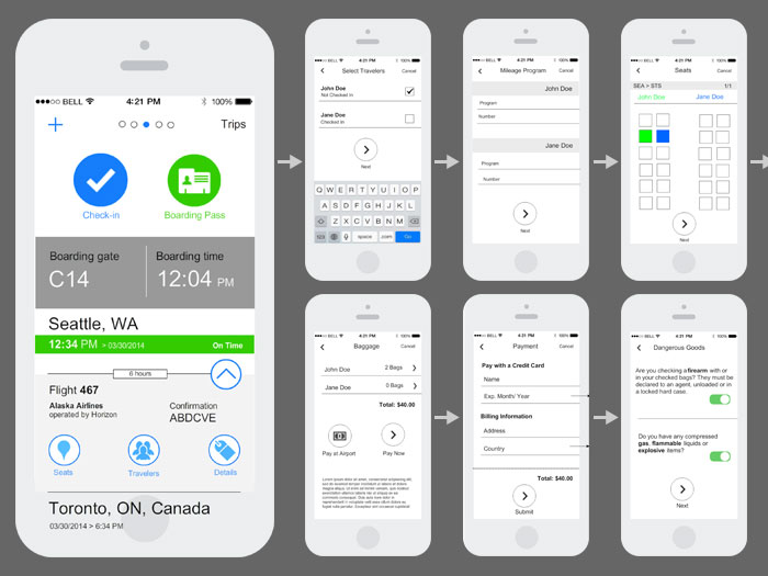
- Wireframe concepts of the “flight info” screen
- Partnered with product management to review concepts and manage development
- We created three different wireframes concepts – then headed out to the airport to get customers to walk through paper prototypes
- Refine prototypes and make them digital
- Employed an online community where we could post prototypes, qualify the demographic of users, and get quick results on iterations

Structure approved. Ready for some UI magic.
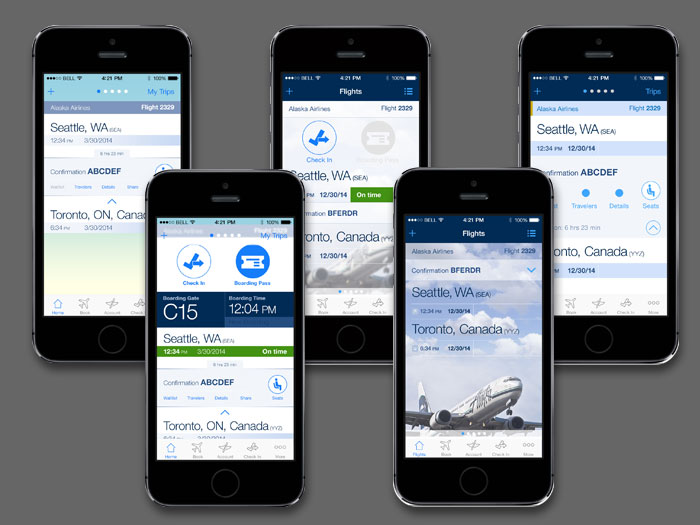
- The release of iOS7 created a beautiful UI environment to start with
- We wanted to create a consistent in context user experience across all mobile properties (iPhone, Android, and Windows Phone). An iPhone app should feel like we designed it for iOS users, and the Android app should make Google people proud that somebody designed something for them
- We had the UX finalized, but the Alaska Airlines brand was in flux. We kept the palette simple so we could adjust quickly once the rebrand caught up
- Started with a couple of basic page flows that we knew were generally not changing drastically and started thinking about the aesthetics of the screen: make it simple and keep things feeling natural for the customer
- UI designs also went out to the airport to make sure we weren’t losing hierarchy or hiding actions
- After refinement, started broadening the scope of the pages to see it across different areas of the app
Time for a gut check: and then build.
- You always keep in mind that someone has to build the app – check-in’s with product and development are critical during the process. This worked well in Alaska’s new agile scrum environment
- We initially red-lined designs to create a guide of reproducible positioning and sizing of elements
- As features are built, we would go out to the airport and user test some more


Alaska Airlines iPhone App Awards and Mentions
- iTunes App Store: Rated 5 stars (only 5 star app in industry) more
- Web Marketing Award 2014: Best Airline Mobile App, Best Travel Mobile App more
- Geekwire: App of the week more
- Geekwire: App of the year finalist more
- TravelPulse report: Applause rates the best apps in travel more
- Fortune.com: Don’t Travel Anywhere Without These 10 Apps more
- EyeForTravel Mobile Innovation in Travel Finalist: Best Mobile Travel App, Best Mobile User Experience more
Any system that sees aesthetics as irrelevant, that separates the artist from his product, that fragments the work of the individual, or creates by committee, or makes mincemeat of the creative process will, in the long run, diminish not only the product but the maker as well.