Project Description
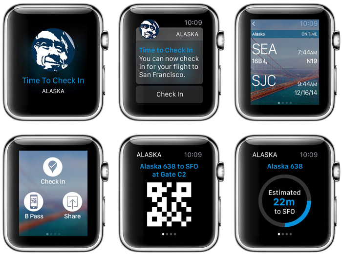
Apple Corp. contacted us in 2015 and asked us if we’d be interested in partnering with them for the launch of the new Apple Watch and create a companion app for the already successful Alaska Airlines iOS app. You have to ask?
We quickly assembled a team of four people. I assigned my lead UX designer to head down to Cupertino with two developers and a tester, where they would be sequestered for a week at Apple headquarters designing and building the v1.0 Alaska Airlines app for Apple Watch. Some quick, up-front planning work and then constant communication between us in Seattle and the team in Cupertino helped the Watch app be a good experience, even for a device that was sort of untested in the real world.
Project Details
Client Alaska Airlines
Date March 2015
Skills Creative direction, project management, team leadership, mobile design
Understanding the platform.
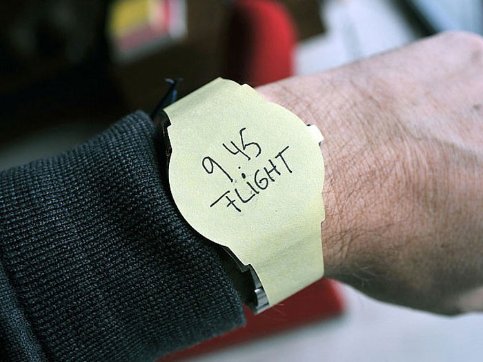
First of all, we should have invested in 3M before starting. We went through a lot of Post-It® notes. Initially, what was important was understanding glances, apps and notifications. As we dug into the HIG to better understand Apple’s intentions with these different interactions, we started to study the context of what would a traveller need, and when. General information, notifications, flight status, delays, gates, times…it’s all useful, but when does it go to the phone, and when does it need to go to the wrist?

We just need to simplify.
It was an interesting balancing act between wanting to give a passenger everything we can, and getting down to exactly what they need. Timing was very important. Check in notifications could happen 24 hours ahead of the flight. Flight delays are important. Gate changes are important. Initial concepts like these helped us start refining the important info for a customer as we took them to the airport to test how people responded to it.
Watches still have a ways to go.
The final outcome was successful in the way it used the watch efficiently for our users. On the other hand, less than 1% of our passengers use a watch for travel. And the next snag is that scanning at airports is inconsistent, and in some cases, impossible to get a watch to scan based on the format of the scanning device. At this point, the Apple Watch App was a great exercise in doing some innovative thinking for our mobile team, but with Apple Watch sales starting to decline, we’ll see how well this device type catches on with flying customers.


